Every Options Trade on Deribit Is Public. I Built a Terminal to Read Them.
Options flow tells you how the market is positioning before the move happens. Not price action, not sentiment on X. Actual capital being deployed at specific strikes, at specific expiries, in specific sizes.
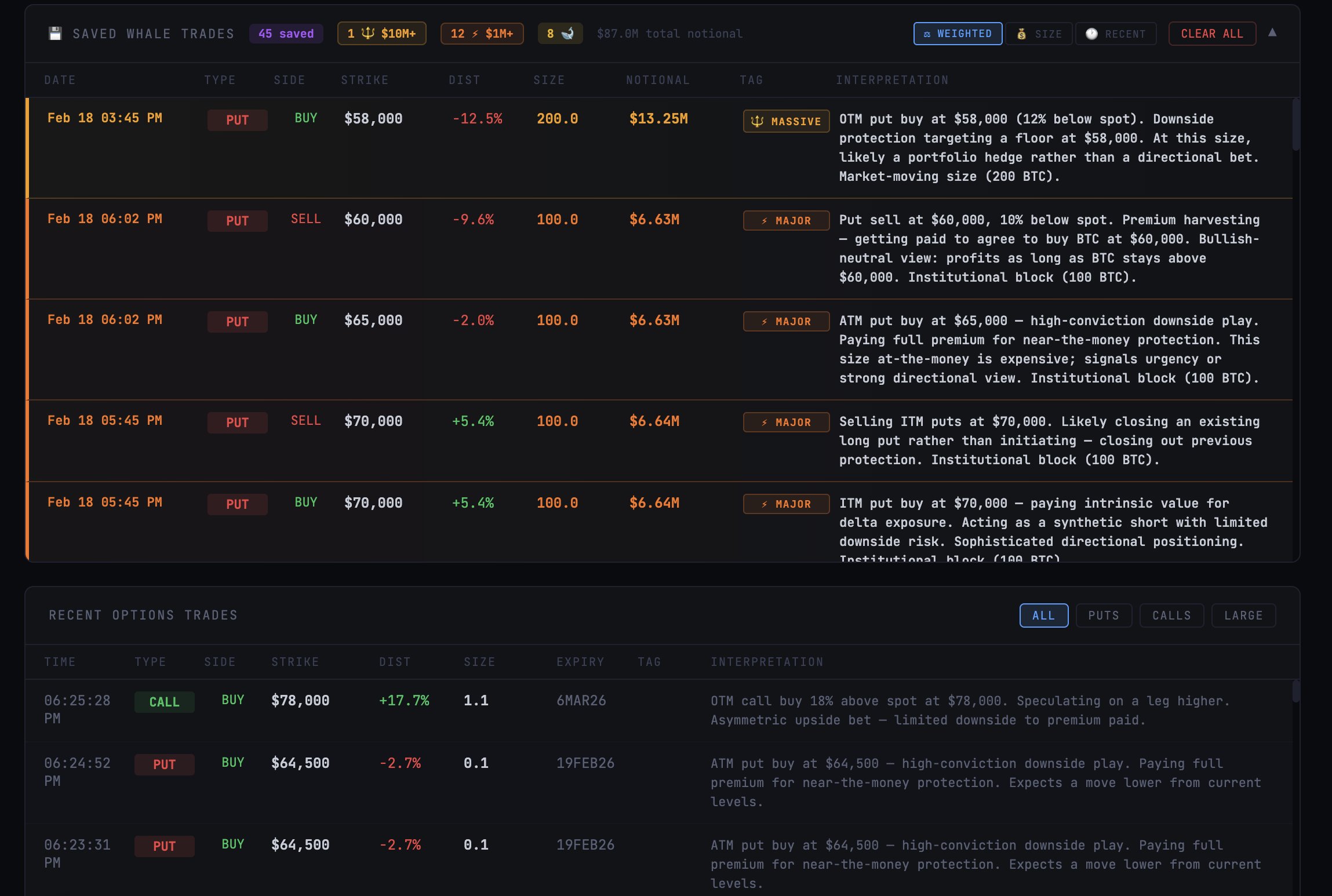
When a fund buys 200 BTC worth of puts at a strike 40% below spot, that’s $13 million saying they want downside protection. Maybe it’s a hedge. Maybe it’s a directional bet. Either way, it’s a data point that most retail traders never see, and it’s sitting on a public API.
Put-call ratios show you the balance of directional flow. Strike clustering shows you where the market expects support and resistance. Volume by expiry shows you the term structure of positioning. These aren’t predictions. They’re records of how money is actually moving.
I wanted a real-time visual view of this flow as it happened on Deribit, the largest crypto options exchange by liquidity. Not alerts in a Telegram channel. Not a static dashboard updated every hour. A live feed with interpretation.
Built a real-time BTC options flow terminal. Pulls live from Deribit's public API every 15 seconds.
— Lalo (@Laloquidity) February 18, 2026
P/C ratio, strike heatmaps, volume by expiry, whale trade tracking with auto-interpretation.
No API keys, no paid feeds. Open source. pic.twitter.com/7oyPO7SrXw
What I built
The dashboard pulls from Deribit’s public REST API. No API keys. No paid data feeds. Three endpoints: get_last_trades_by_currency, get_book_summary_by_currency, and get_index_price. Everything refreshes every 15 seconds.
On every refresh, the system maps every instrument in the options chain to its current mark IV, bid/ask IV spread, open interest, and mid-price. It computes a rolling ATM IV percentile over the session, so interpretations can contextualize whether volatility is cheap or expensive relative to recent history.
The top of the dashboard shows live BTC price and the current put-call ratio. Below that, strike heatmaps show the top put and call strikes by volume, with distance from spot price. A volume-by-expiry chart shows where positioning concentrates across the term structure.
The interpretation engine
Every trade gets a structured interpretation containing four fields: a compact tag line, a full paragraph with IV and premium context, machine-readable metadata tags, and a sentiment classification as bullish, bearish, neutral, or vol_trade.
The feed uses a compact-first design. Each row shows a sentiment-colored tag line and an IV column alongside the existing trade fields. Clicking any row expands to reveal the full interpretation paragraph, mark IV, bid/ask IV spread, open interest, and mid-price in BTC and USD.
The IV context transforms every read from structural to market-conditions-aware. A put buy when IV is at the 15th session percentile reads as a buyer getting good value on cheap vol. The same trade at the 90th percentile reads as urgency or panic, because the buyer is paying expensive premium to get positioned. This single dimension turns a five-variable decision tree into a nine-variable model producing structured, context-aware reads.
Multi-leg detection
The feed automatically identifies when individual trades are legs of the same strategy. Trades that execute within two seconds of each other at matching sizes (within 20%) are grouped and classified.
| Structure | Detection Criteria |
|---|---|
| Vertical Spread | Same type, opposite direction, same expiry |
| Straddle | Different type, same direction, same strike, same expiry |
| Strangle | Different type, same direction, different strikes, same expiry |
| Risk Reversal | Different type, opposite direction, same expiry |
| Calendar Spread | Same type, same direction, different expiry |
Grouped trades appear as combined rows with purple structure badges and thesis-level interpretations. A bull call spread at $90K/$95K reads as “limited-risk directional bet, profits if spot moves above upper strike.”
Directional heatmaps
Strike heatmaps no longer aggregate buy and sell volume into a single bar. Each strike now renders as stacked green and red segments, with net direction badges showing BUY, SELL, or MIXED. Each bar includes signed net volume and buy/sell counts.
This immediately answers whether protection is being added or removed at a given level. The old single-color bars couldn’t tell you that.
Market interpretation
The summary panel runs five analytical layers.
Delta-weighted P/C ratio weights ATM trades at 1.0x and deep OTM trades at 0.1x. This eliminates the noise of distant strikes inflating the raw ratio. Both raw and weighted ratios display with divergence commentary.
Direction-aware strike concentration shows the buy versus sell split at the most active put strike, with net flow interpretation distinguishing new protection from premium harvesting.
Term structure read breaks down flow by DTE bucket with classification: gamma-seeking tactical flow versus structural positioning.
ATM IV context shows current ATM implied volatility with session percentile and regime classification.
Flow Toxicity Score measures the net directional bias of taker flow on a scale from -1.0 (all bullish) to +1.0 (all bearish). It renders as a color-gradient horizontal gauge with labeled endpoints.
Whale tracking
Every trade over $100K notional gets saved to local storage. Trades are classified into tiers:
| Tier | Threshold | Treatment |
|---|---|---|
| MASSIVE | $10M+ notional | Pinned to top, gold highlight |
| MAJOR | $1M-$10M | Pinned below massive, orange |
| WHALE | 50+ BTC | Purple tag |
| Large | $100K+ notional | Blue tag |
The tracker persists across refreshes. Close the tab, come back later, the full session’s whale activity is still there. 500-trade cap with deduplication by trade ID.
Not all whale trades carry the same conviction. A $5M put expiring in 90 days is insurance. A $5M put expiring in 3 days is a bet. The sort reflects this. Each trade receives a floating-point score from five weighted factors:
| Factor | Weight | Description |
|---|---|---|
| Notional | 40% | Log-scale, no cliff effects at tier boundaries |
| DTE Urgency | 25% | Exponential decay with 7-day half-life |
| Spot Proximity | 15% | ATM/NTM trades rank above deep OTM |
| Adversity | 10% | Positions moving against you rank higher |
| Recency | 10% | 48-hour half-life decay |
ITM positions within 3 DTE trigger maximum urgency for exercise events. Expired trades sink to the bottom, ordered by most-recently-expired first.
Each saved trade receives the same IV pipeline data as the live feed. Every interpretation includes IV regime context, and each row displays a sentiment-colored compact summary with an IV badge.
The stack
React 19, Vite 6. Dark terminal aesthetic, JetBrains Mono font. No external UI libraries. Everything inline-styled. One command to start, zero configuration.
Persistent storage
The initial version stored everything in localStorage. Close the tab, and any new trades that came in while you were away were gone. That’s fine for a live feed, but whale trades are the ones you want history on.
Deployed to Vercel with a Supabase backend. An external cron job hits the Deribit API every 60 seconds, filters for whale-level trades ($500K+ notional or 50+ BTC), and upserts them to a Postgres table. The frontend dual-writes: localStorage for offline fallback, Supabase for persistence. When you open the dashboard, it merges both sources, deduped by trade ID.
The result is gapless coverage. Close the tab Friday night, open it Monday morning, and every whale trade from the weekend is there.
Strike-level interpretation
Individual trade reads are useful, but they miss the bigger picture. A single $13M put buy at $58,000 reads as “portfolio hedge.” Nine trades totaling $38M at $58,000 across two expiries reads very differently. That’s deliberate institutional accumulation at a specific level.
The interpretation engine pre-computes strike-level aggregation across all saved trades. Instead of reading each trade in isolation, it cross-references positioning at the same strike and surfaces the pattern: “concentrated $93M institutional put position at $60,000 across 7 expiries. This level of accumulation signals a deliberate portfolio-level hedge.”
Expiry breakdown
The expiry table includes a DTE column color-coded by urgency: red for seven days or less, yellow for eight to thirty days, cyan for ninety days or more. Each expiry carries a classification badge: WKLY, MTHLY, QTRLY, or LEAPS.
A term structure summary line sits at the top. When 72% of flow concentrates in seven-day DTE or less, the read is “gamma-seeking tactical stance.” When it shifts to longer-dated expiries, it reflects structural positioning.
Short-dated options bleed theta rapidly. Whoever placed the trade is paying a premium for a very specific time window. A fund rolling long-dated hedges is routine portfolio maintenance. A fund buying near-term puts at scale is expressing a view on this week.
Spot movement since entry
Every saved trade stores the BTC price at the time it was captured. The dashboard continuously compares that entry price to current spot and shows the percentage move, color-coded by whether it’s favorable or unfavorable for that specific position type.
A put buyer benefits when spot drops. A call buyer benefits when spot rises. A put seller benefits when spot stays flat or rises. The color logic accounts for all of this.
This turns a static trade log into a live conviction tracker. You’re not just seeing that someone bought $13M in puts at $58,000. You’re watching whether that thesis is playing out or bleeding.
Direction corridors
Individual trade reads can miss the forest for the trees. Five separate put buys at $55K, $58K, $60K, $62K, and $65K look like five independent trades. They’re not. That’s a layered downside position across a range.
The terminal groups same-direction trades across nearby strikes, within roughly 15% of each other, and surfaces the cluster as a single positioning thesis. Instead of connecting five dots manually, you see: “$38M put corridor from $55K to $65K across 4 strikes, layered downside protection.”
This is how institutional desks actually build positions. They don’t concentrate at a single strike. They layer across a range to manage slippage and distribute risk. The corridor view reflects how the position was actually constructed.
Expired outcomes
When an option expires, the terminal retroactively labels whether it finished in-the-money or out-of-the-money. A put at $58,000 that expired with BTC at $55,000 printed. A put at $58,000 that expired with BTC at $66,000 expired worthless.
Over time, this provides a scorecard. Which whale bets were right. Which were expensive protection that was never needed. How often institutional hedging actually gets tested. It’s a record of conviction versus outcome, built automatically from the same public data.
What showed up
During the first session, that 200 BTC put buy came through at the $58,000 strike. $13.25 million notional. The system immediately flagged it as a MASSIVE trade and tagged the interpretation: “deep OTM put buy, tail risk protection or bearish bet below $58,000.”
That’s the kind of trade that, on a traditional terminal, you’d pay hundreds a month to see. It’s public data. It always was.
The repo is at github.com/laloquidity/btc-options-flow. Clone it, run it, or check it out live while it’s hosted.